︎︎︎ Problem
As Gravity continues to expand into new product categories, the brand’s visual expression and product categorization feels too constrictive.︎︎︎ Role
Creative Direction
UX Design
UX Research
Strategy
Design Systems


︎︎︎ Opportunity
Gravity believes that rest and recovery are two essential pillars for achieving peak physical and mental performance.︎︎︎ Insights
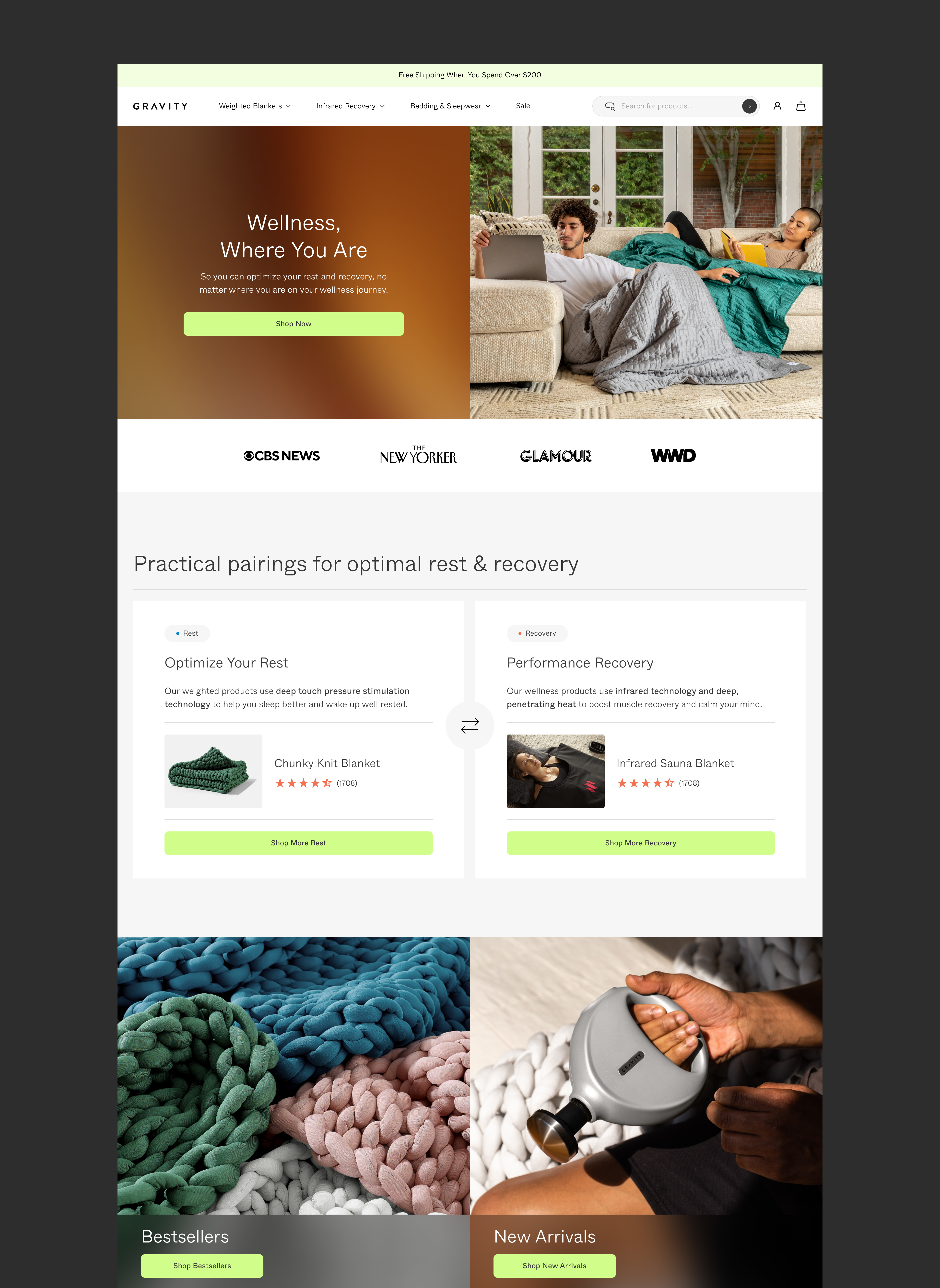
We lean heavily into the weighted blanket space, but we want to reposition as a holistic rest + recovery brand.
New visitors represent 81.51% of traffic and 51.7% of transactions, meaning there is an opportunity to reimagine our brand story-telling and the associations users have with Gravity.
︎︎︎ Design Direction
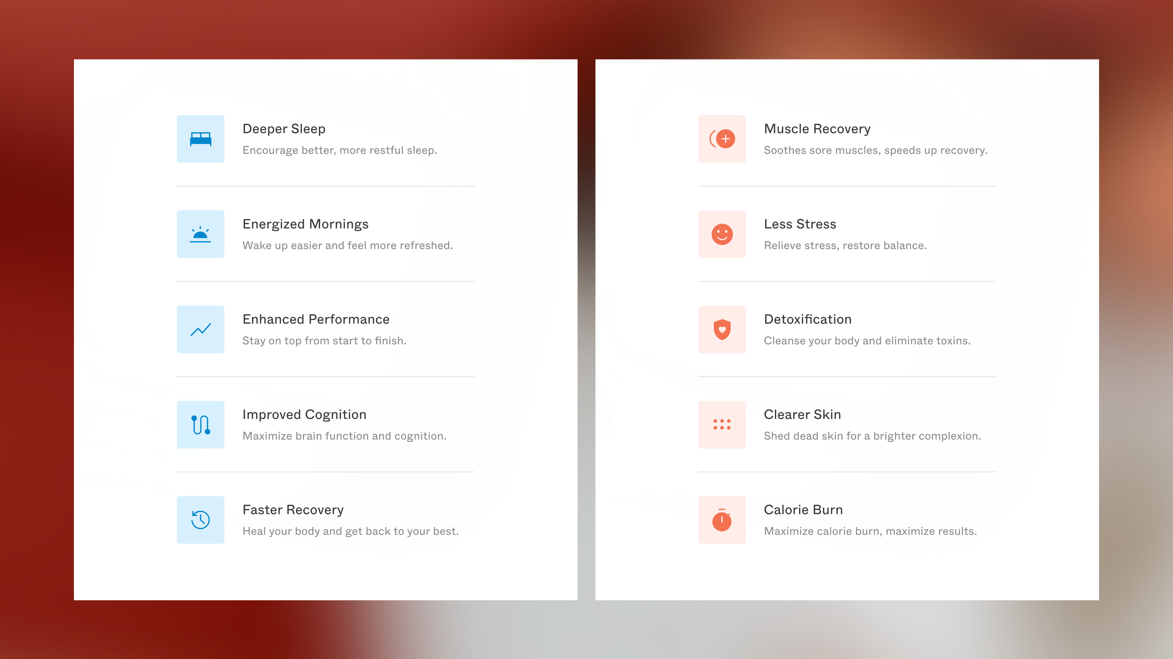
Choosing a singular typeface assumes clarity and confidence, and the combination of smooth and sharp transitions nods to those two distinct, but symbiotic brand pillars. In our iconography, cool tones are used to represent rest, while warm tones are used to represent recovery.
︎︎︎ Typography

︎︎︎ Iconography
︎︎︎ Visual Devices
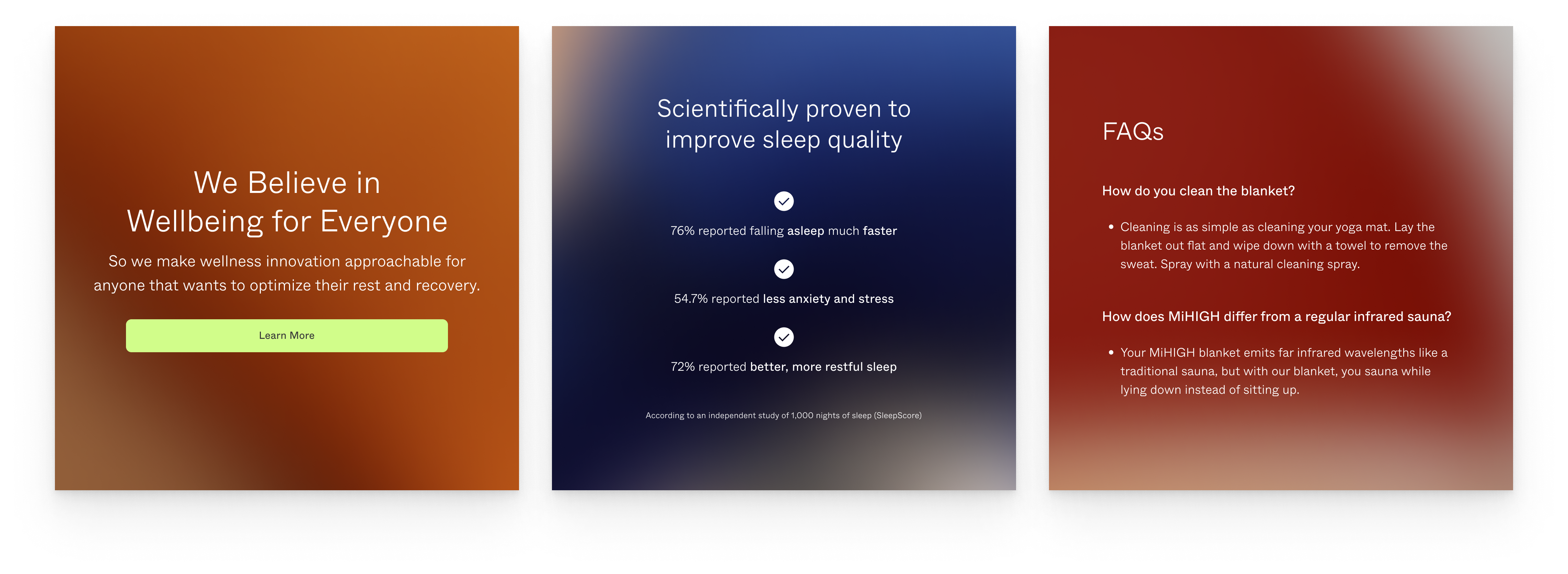
Coupled with the overall high-structure, minimalist design, these blurred image containers for type overlays suggest a sense of fluidity and nod to the way that routine can promote more balanced, unstrained feelings of wellness.
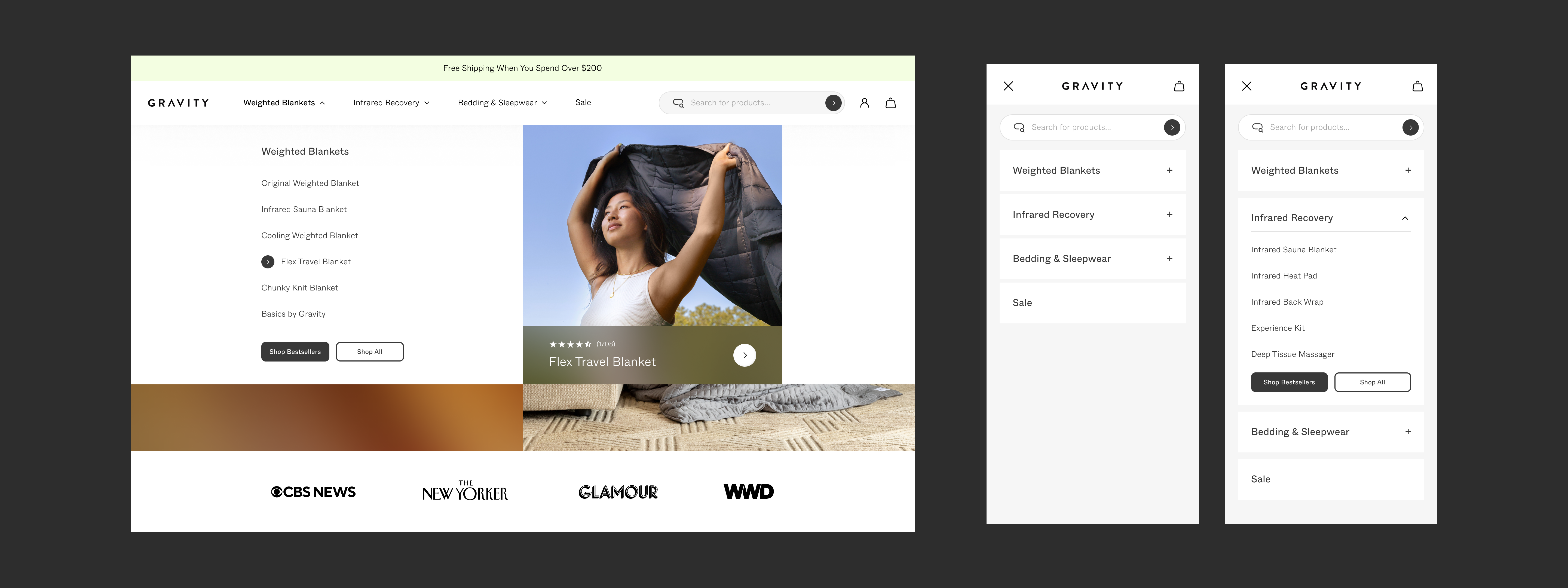
︎︎︎ Global Navigation
See Prototype︎︎︎
︎︎︎ Home
︎︎︎ Product Detail Page

︎︎︎ Rest + Recovery
Two distinct shopping touchpoints that flex based on product.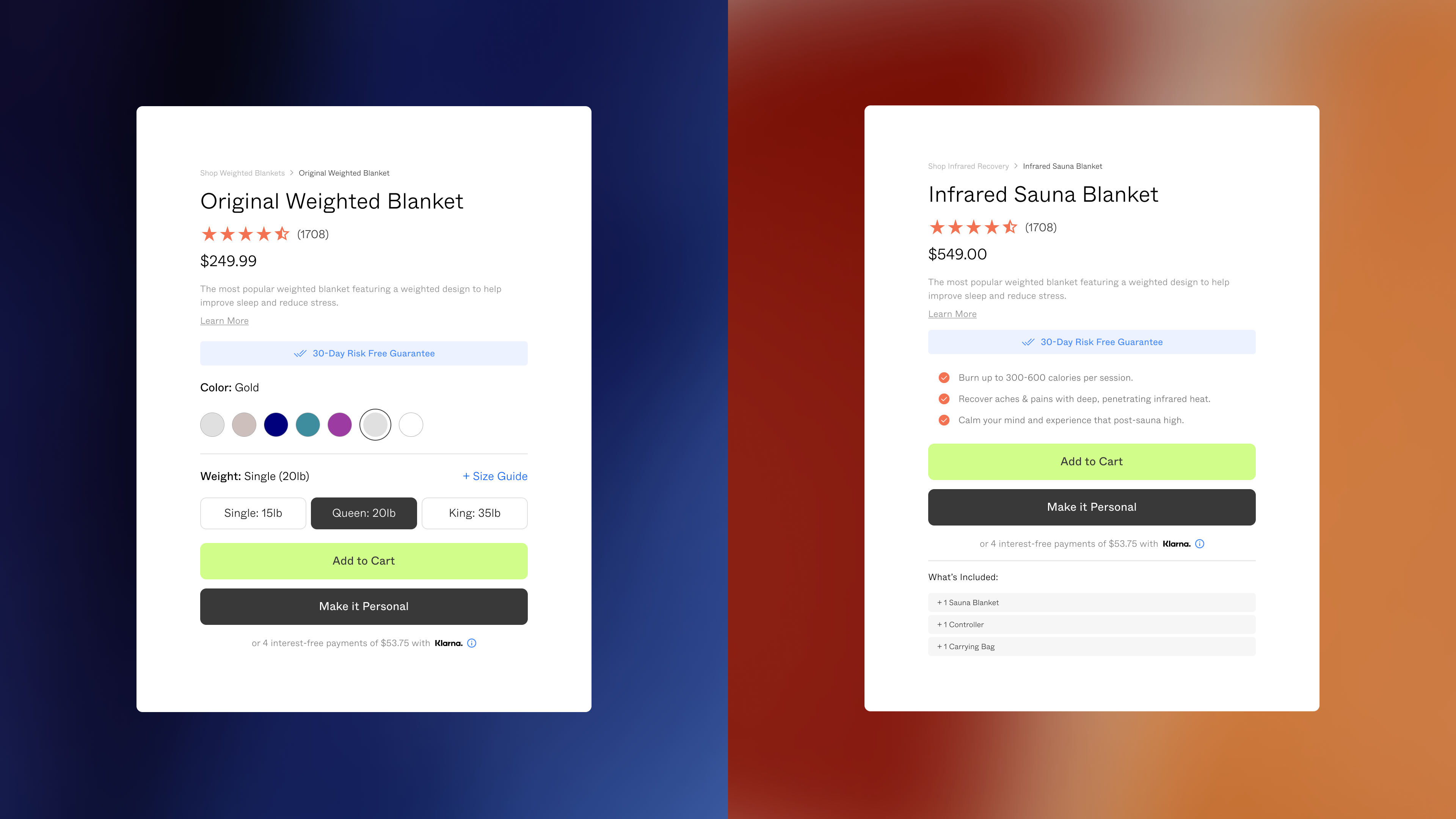
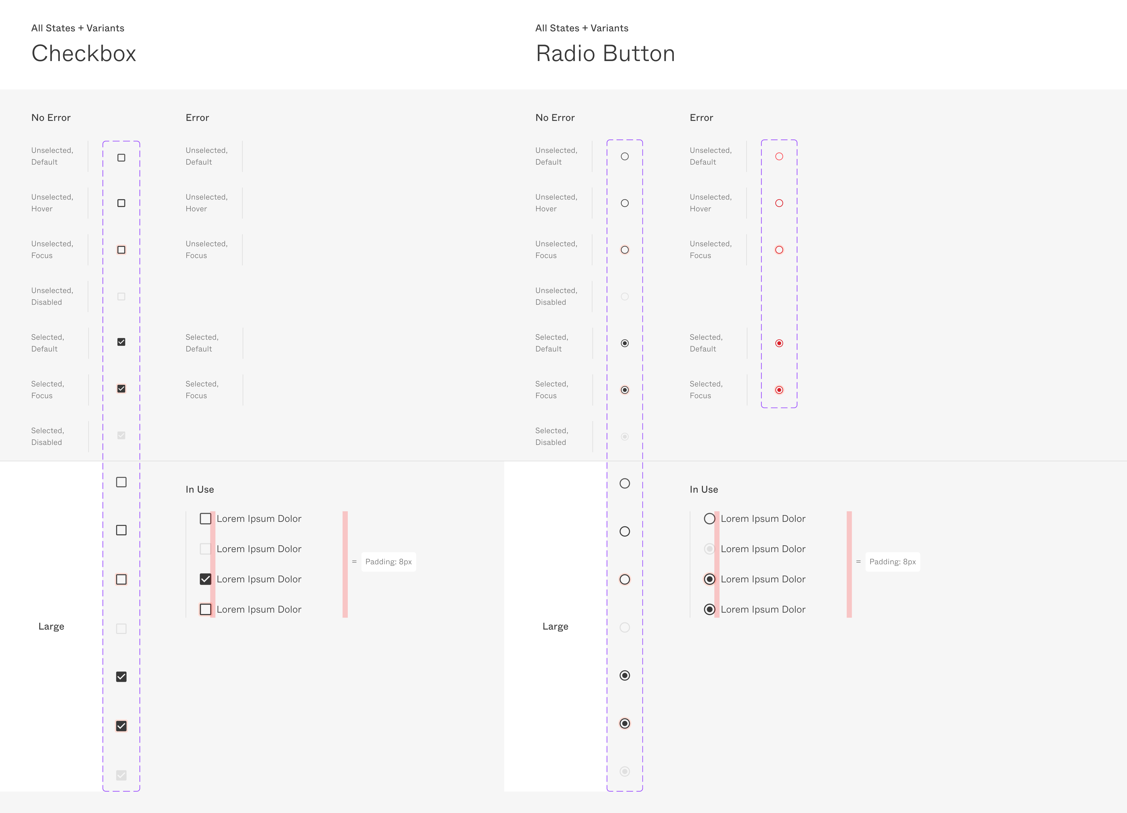
︎︎︎ Components
A flexible library of components to make iteration more efficient.
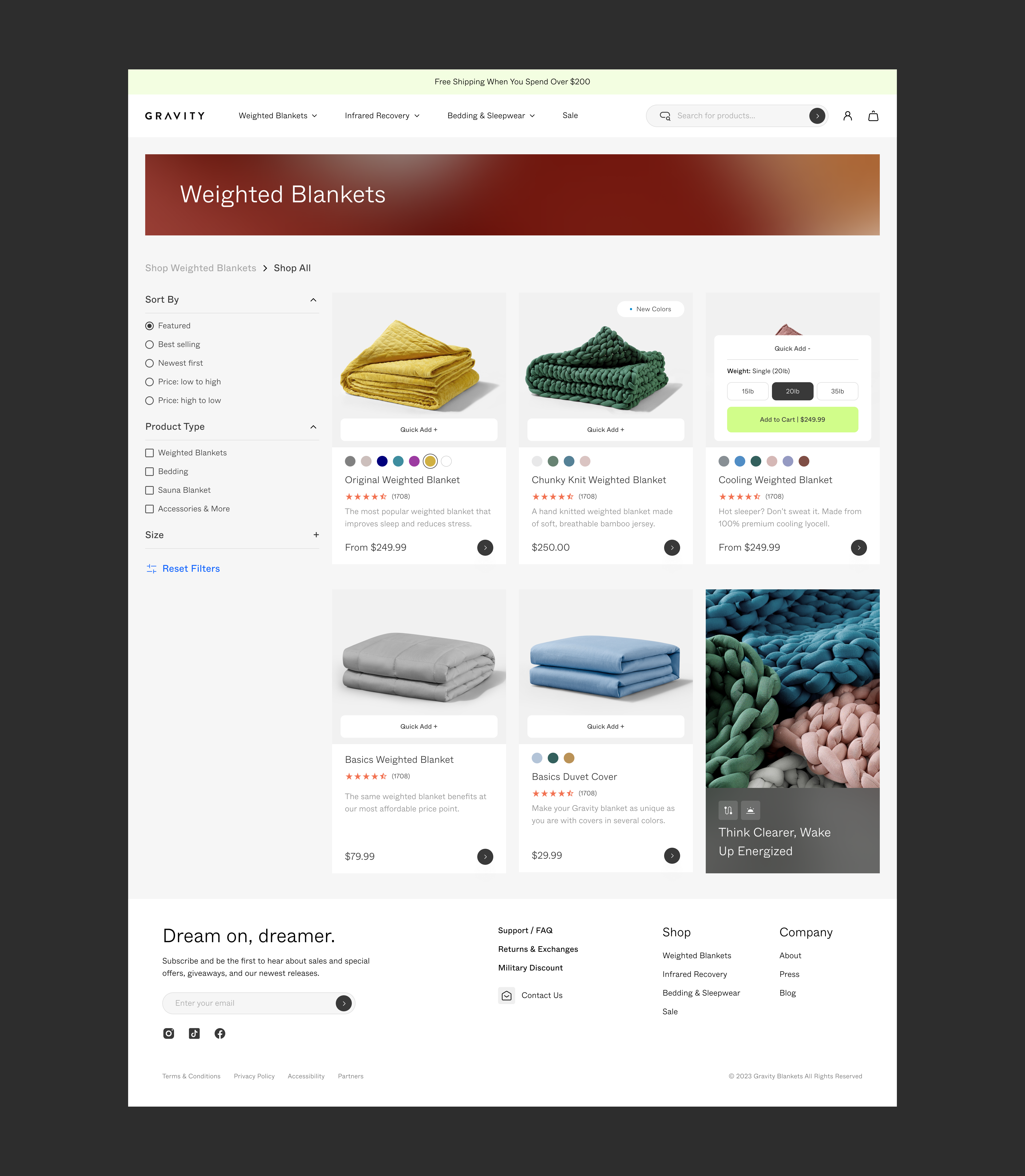
︎︎︎ Collection Page
︎︎︎ Sticky Add to Cart

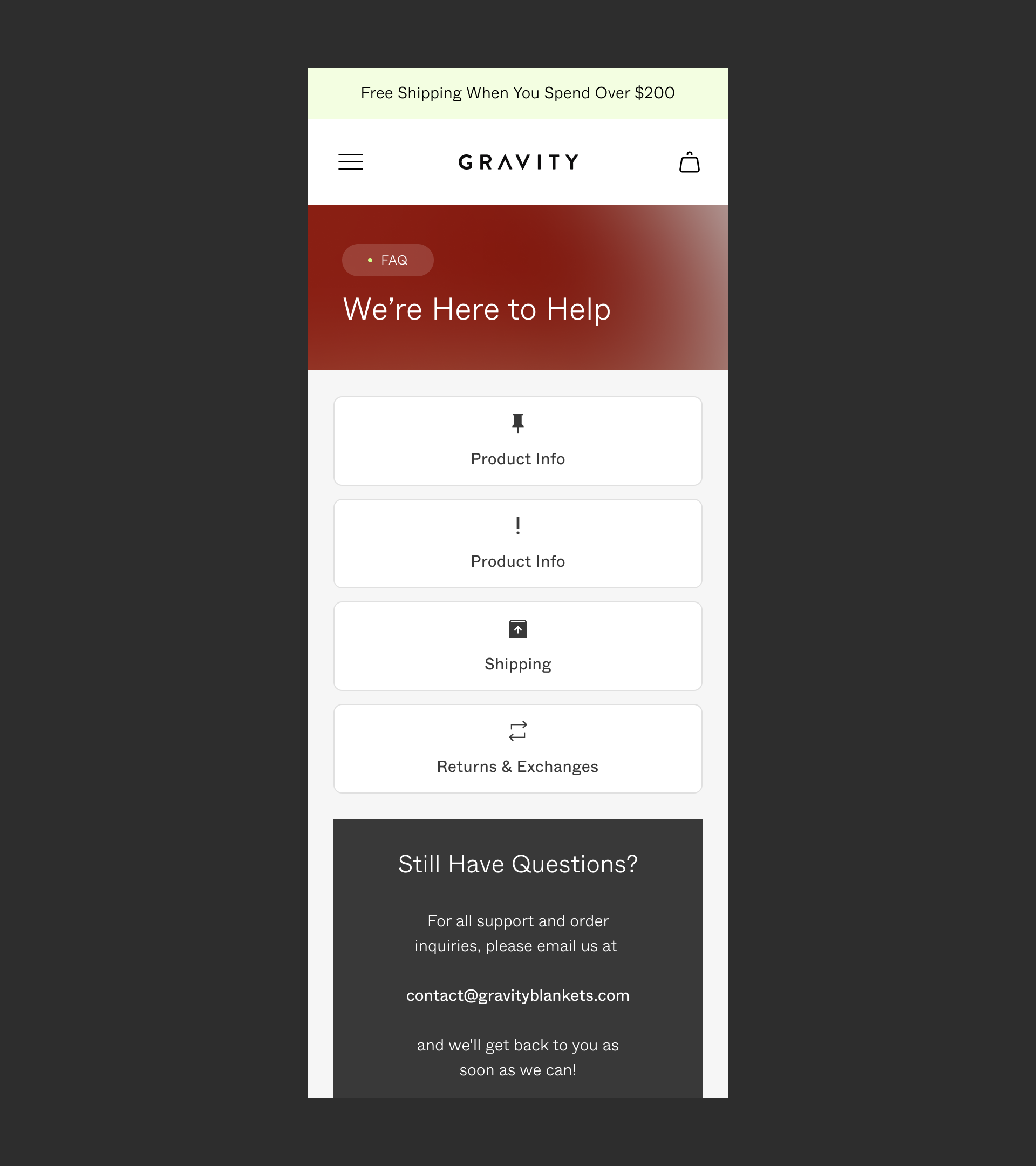
︎︎︎ FAQ Local Navigation
︎︎︎ Documentation
Detailed documentation to ensure consistency and efficiency when iterating, testing, and handing off to engineering.